The shape of your notes
I suffer a compulsion for note taking that forces me to carry small notebooks all the time. I found this simple technique a great stress reliever; it allows me to keep my mind clear and focused, delegating all the popping thoughts to a simple analog buffer.
There are lot of things to love about notebooks. They are fast, flexible and responsive. Infinite battery, über-cheap, valid for longterm storage by default. No unlock/slide/micro-delay/tap/tap/micro-delay/write/tap/lock process. As good as tablets and phones are getting these days, the time to record a few words on them is still longer and more complex than scribbling in a piece of paper. Yes, paper is still awesome in many, many, many, many, many ways.
And I’m not the only person that suffers from this disease. A few months ago my friend Brian Suda showed me a few prototypes for custom notebooks he had been developing. The prototypes used different icelandic landforms and animals as design for the cover. Some of them displayed the intriguing shape created by landscape’s isolines. As they were early prototypes, Brian had traced all the isolines by hand, using a real map as guide in Illustrator.
During the following months I fall in love with the idea of creating a series of notebooks using real, nice maps for its design. I wanted to keep the abstract beauty of the contour lines but, at the same time, respect the old tradition for accuracy that cartography has, without incurring in an incredibly time-consuming process.
Creating maps
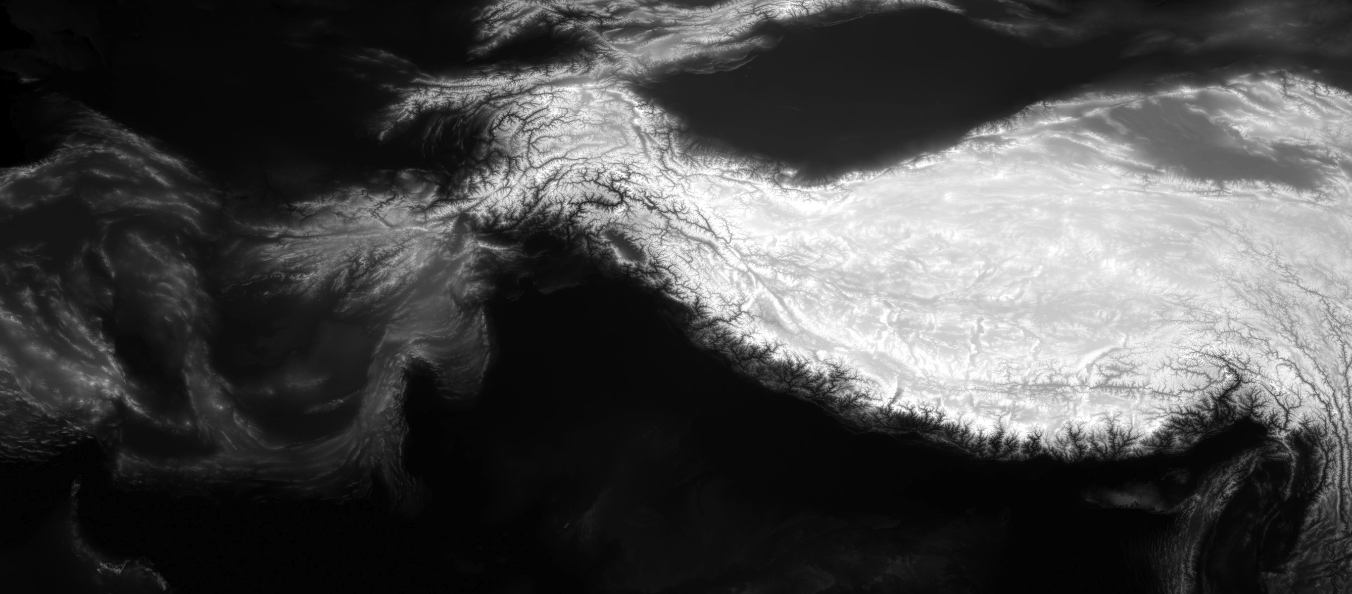
I started investigating tools and libraries. First discovery was the concept of Digital Elevation Models (or DEMs). They’re digital raster representations of the terrain’s elevation through the surface of the Earth. There are a lot of different types of DEMs but one the most commons is a black and white heightmap:
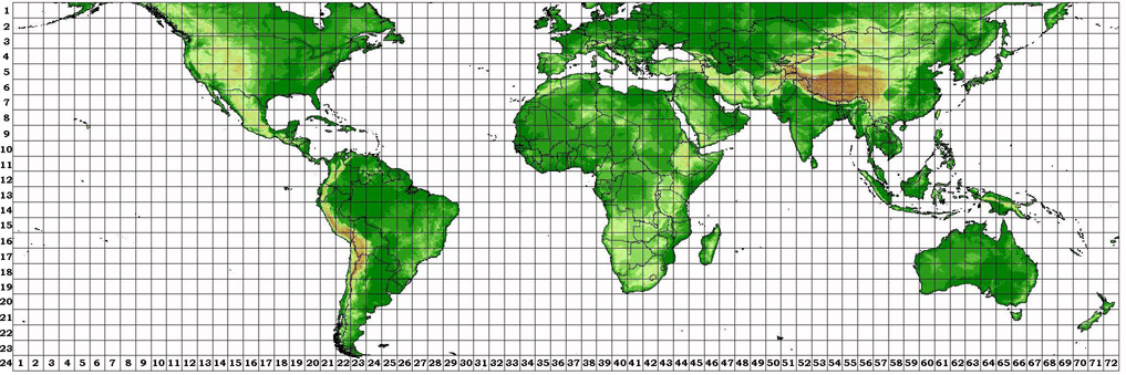
So I started looking for DEMs suitable of use for the maps and found the Shuttle Radar Topography Mission (or SRTM). For eleven days in February 2000 the Space Shuttle “Endeavour” and its seven brave astronauts executed the Shuttle Radar Topography Mission, mapping most of the world’s topography at a resolution of three arc seconds.1 Unfortunately the mission worked only in the area between 60°N and 56°S leaving most of Northern Europe (and places like Iceland) without elevation models:
But many people in the GIS community supports open source and open data, and I was able to find a grid of DEMs for Iceland in the same resolution and with very good quality thanks to Yashin Aleksander.
Once you’ve the raw data is time to find the tools to act on it. Very soon after I started searching the web and GitHub for libraries I found GDAL. GDAL is an amazing toolkit for geospatial data transformation that comes with a variety of great command line utilities. Using them I was able to create the isolines of each part of Iceland, initially testing by hand on a few tiles and later with help of a few scripts processing the whole country.
Working with Isolines
At this point I had 48 1°×1° blocks, each one containing the contour lines of a part of the country in Shapefile format, a geospatial vector data format perfect for editing.
I had no idea of how were these lines going to look so I needed a simple, fast and interactive way to check it out. The first thing that came to my mind was CartoDB, a great service created by my friends of Vizzuality that provides a way to create dynamic maps and geo visualizations with ease.
I started uploading the shapefiles to CartoDB and almost instantly bumped into some limitations with the size quota assigned to my free account but even with a few tiles uploaded it was clear what to expect of the data and the result was very promising.
Thanks to one of the core developers of the service, Javier Santana, that taught me a few PostGIS tricks to optimize the data and fit it in my account, you can now enjoy the contour lines of Iceland in all its glory:
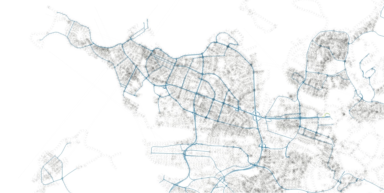
The exploration continued then in QGIS, an amazing piece of -open source- software for geo data manipulation: raster, vectorial, multiple projections, layers… Don’t let the ugly Qt interface fool you, this thing is really amazing, you can do all kind of crazy stuff like hairy city maps:
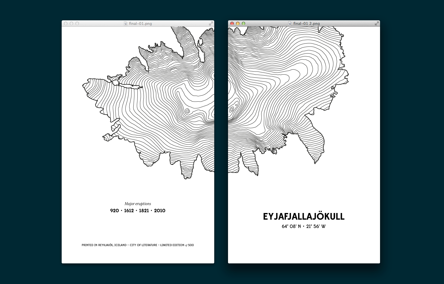
At this point, it was easy to explore specific points like glaciers, mountains, etc. and see which ones had nice shapes. The attention focused then in Eyjafjallajökull, the glacier sitting on top of the volcano that spread chaos in airports around the World during its 2010 eruptions.
But how to isolate accurately the contour lines of a glacier? Open Data to the rescue again. The Global Land Ice Measurements from Space (or GLIMS) is a project designed to monitor the world’s glaciers primarily using data from satellites, maintained by the National Snow and Ice Data Center. Thanks to this project, it was easy to overlay the glacier’s shape in top of the contour lines and find the proper limits.
With the glacier contour lines outlined by its limits it was only a matter of exporting all this information to something usable in vector graphics software like SVG and the Eyjafjallajökull was ready for the final step.
Millions of points
Why a manual editing? Well, because geographical data is too accurate for a format as constrained as the cover of a small notebook. When we imported the SVG file in Illustrator it was clear that there were far too many points for what we needed:
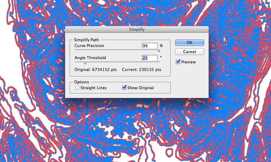
They were so many almost identical points in fact that, as you can see in the previous screenshot, even a simplification keeping 99% of the original precision removed millions of them. After the filtering, the process morphed into a carefully revision of all the contour lines to remove all the possible artifacts (strange right angles, outliers, etc.) generated by the GDAL transformation or the simplification.
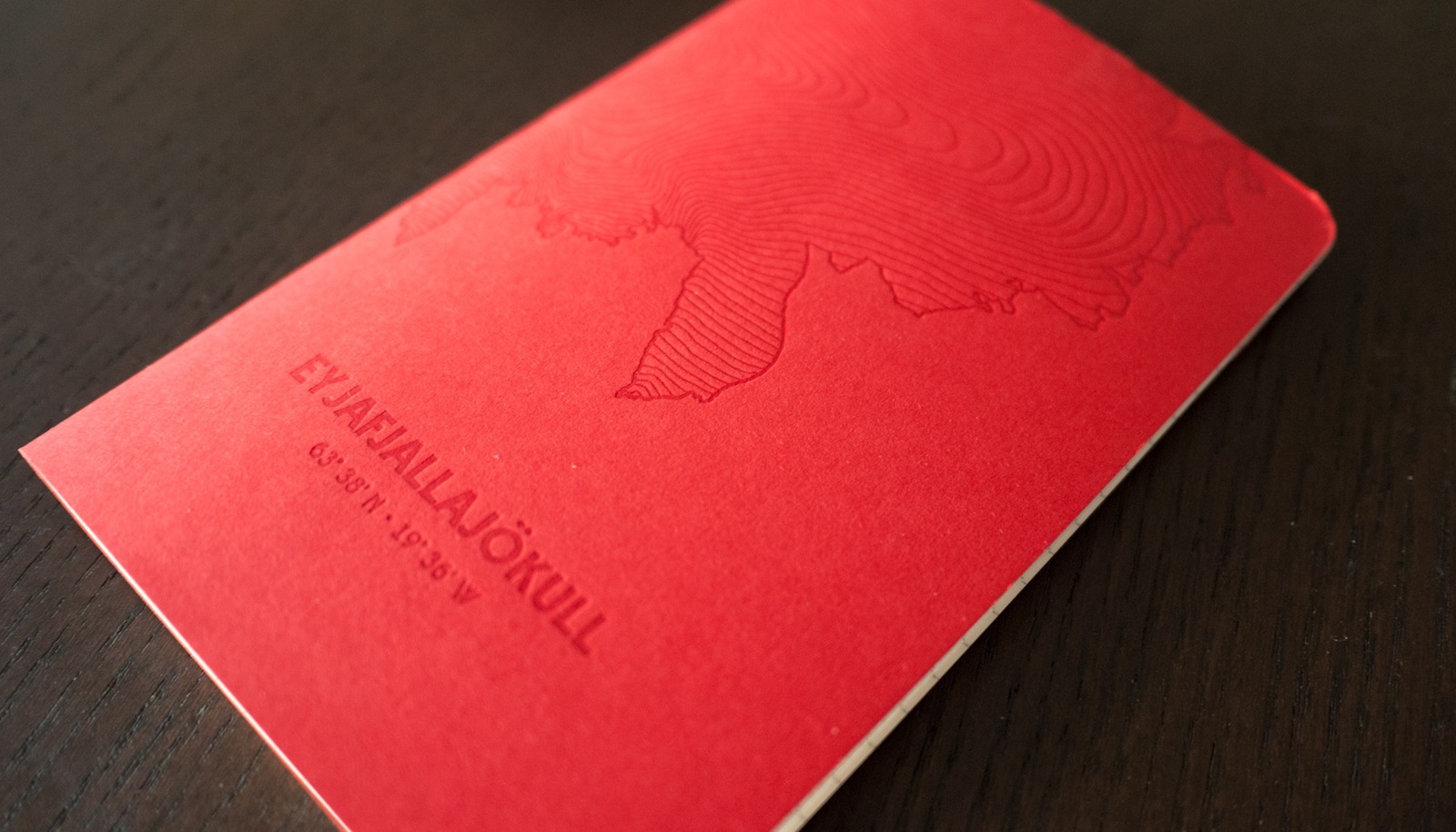
With all the lines nice and tidy after hours of tweaking, the notebooks’ creation entered the last stage: composition. We included the name of the glacier and the year of all major eruptions recorded. Finally we had our design and it was even better than we expected:
The notebooks
With design finished, it was a matter of find the right printer for the task and we went with Reykjavík Letterpress a small local studio specialized in… well… letterpress. Two years ago they printed the Jositajosi’s XMas and the result was quite good.
After a few conversations, estimates and decisions we sent the final PDF with printer marks et al. finishing the first cycle of this peculiar stationery flip-flop, with a limited edition of 1.000 units. A few days later they were in front of us:
First use of these notebooks was to serve as 2012 xmas present to jositajosi’s customers. The feedback has been so amazing -everybody loves them- that we’re putting the remaining copies up for sale. You can get them for as low as 11$ or, even better, in a pack of 3 for just 25$ (and free shipping worldwide!):
Another idea we’ve been thinking about is to transform this one-off project in a series of notebooks. Would you like to see more of these notebooks? Maybe your city or favorite mountain? Your company’s location? Let us know your ideas and we’ll send you a free notebook to wherever you are.
-
http://viewfinderpanoramas.org/topog.html ↩